ISENTRESS CONSUMER EXPERIENCE REFRESH
Merck | ISENTRESS®
Visual Design / Web Design / Print Design
Brand Refresh
Web Design
Patient Education
Print Design
Banner Ads
Overview:
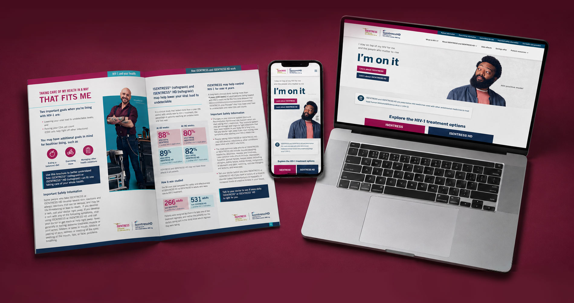
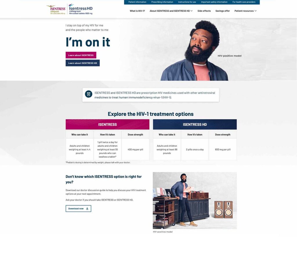
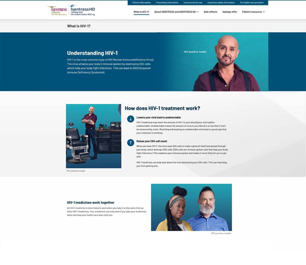
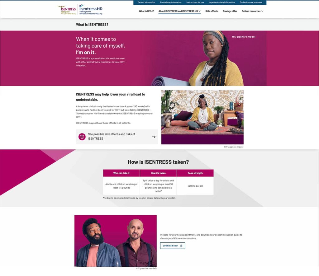
To mark ISENTRESS’s 15-year anniversary, Merck’s marketing team refreshed the consumer experience across the brand website and patient brochure. The updated system introduced new lifestyle photography, an evolved color palette, and a more contemporary look and feel while maintaining the clarity, consistency, and regulatory rigor required for patient-facing pharmaceutical communications.
Role:
As a designer on the brand, I helped carry the refreshed visual direction across both digital and print. I collaborated in selecting the strongest photography from the brand shoot, retouched final imagery, refined the color palette, and redesigned layouts for the consumer website and patient brochure. The work brought complex treatment, clinical, and safety information into a cohesive and approachable visual system across both experiences.